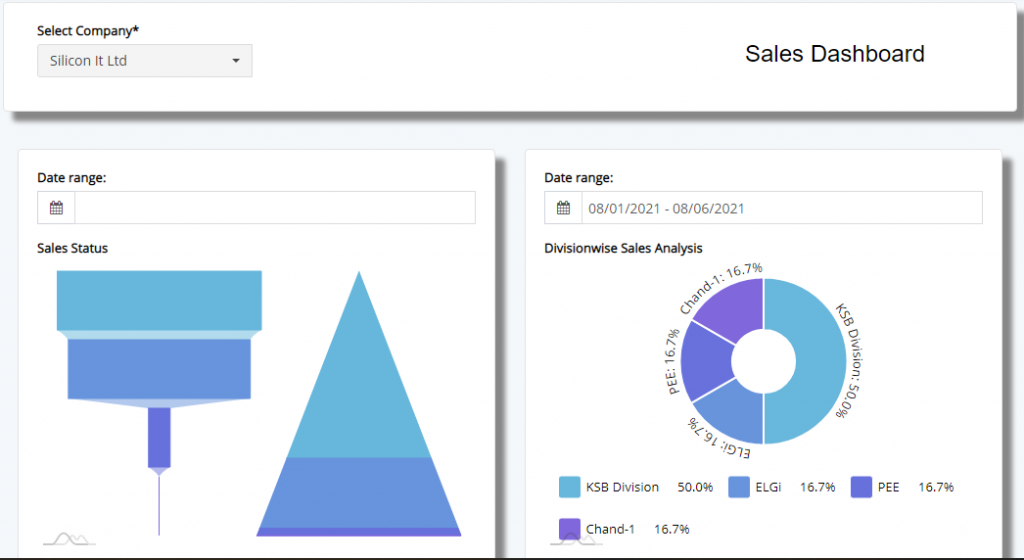
Sales CXO Dashboard if a vital view where, the CXO level employees will be able to view aggregated view of each modules.
Here, the user will have to select the company for which the data is to aggregated to the view mode. Charts are automatically loaded with data but some need to additional date selection to view the data. In the above, the image you see, the data is aggregated in to Funnel and Pyramid charts.
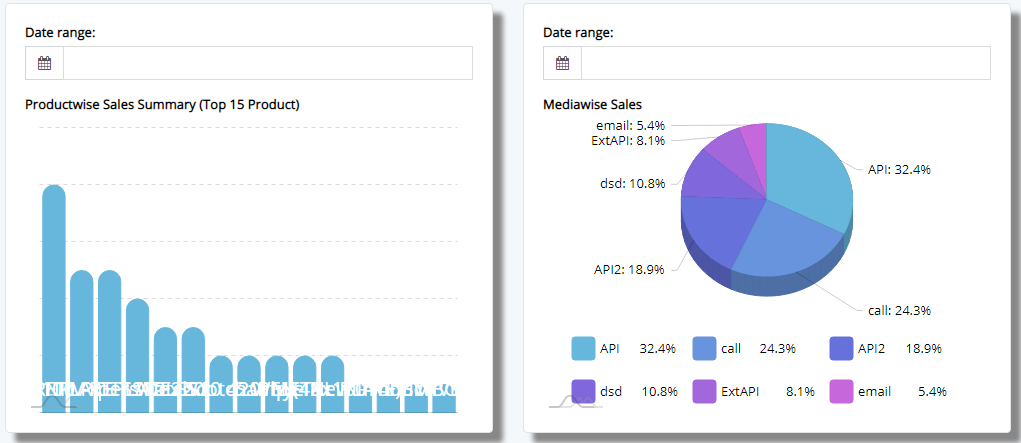
In this section, the data display the Top-15 products which are on high demand based on the sales numbers. Similarly, you have pie-chart which displays the bifurcation based on the source.
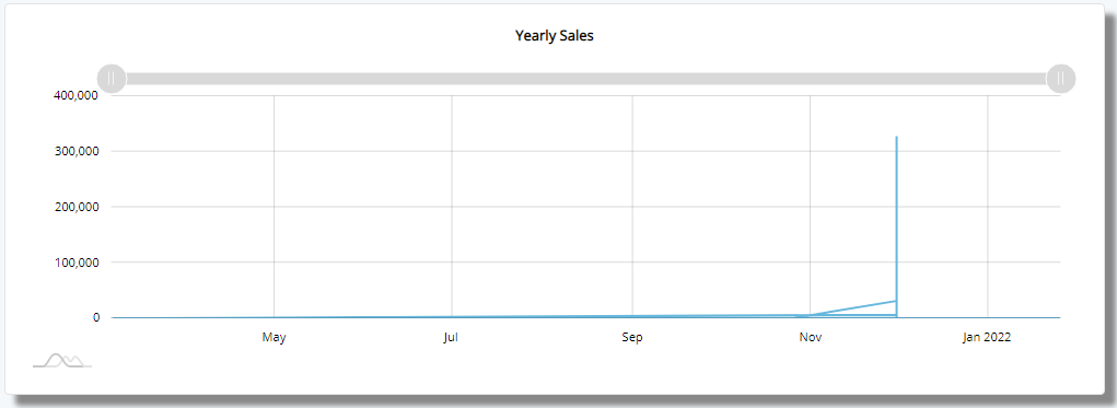
This chart will display the yearly sales that has happened.
Then we have pie-chart, which bifurcates data based on City.

Finally, we have gauge which show the progress made overall against the target set by the management.
This sums up the Sales CXO Dashboard.