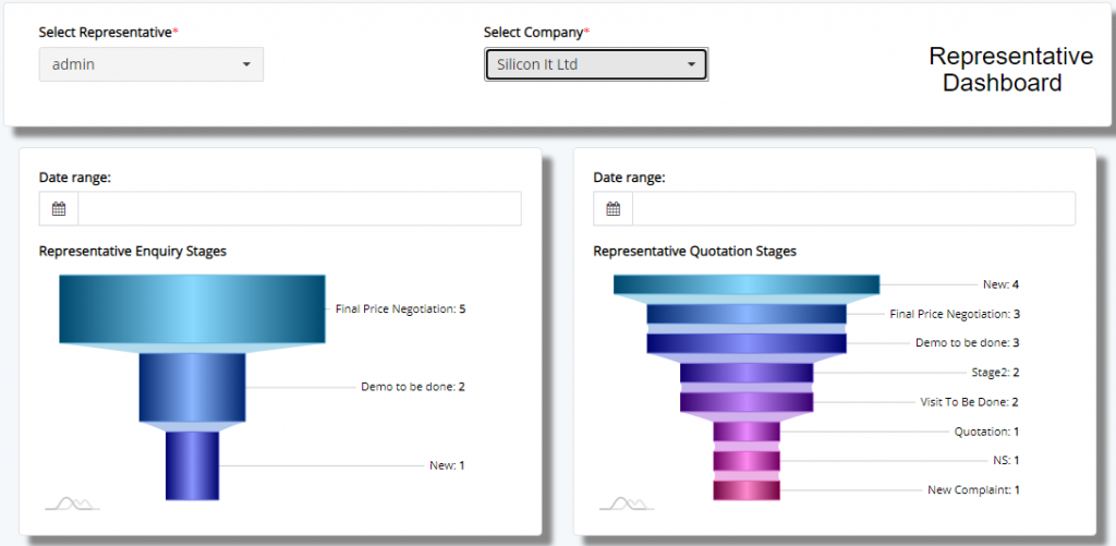
Representative CXO Dashboard if a vital view where, the CXO level employees will be able to view aggregated view of each modules.
Here, the user will have to select the representative and company for which the data is to aggregated to the view mode. Charts are automatically loaded with data but some need to additional date selection to view the data. In the above, the image you see, the data is aggregated in to Funnel and Pyramid charts.
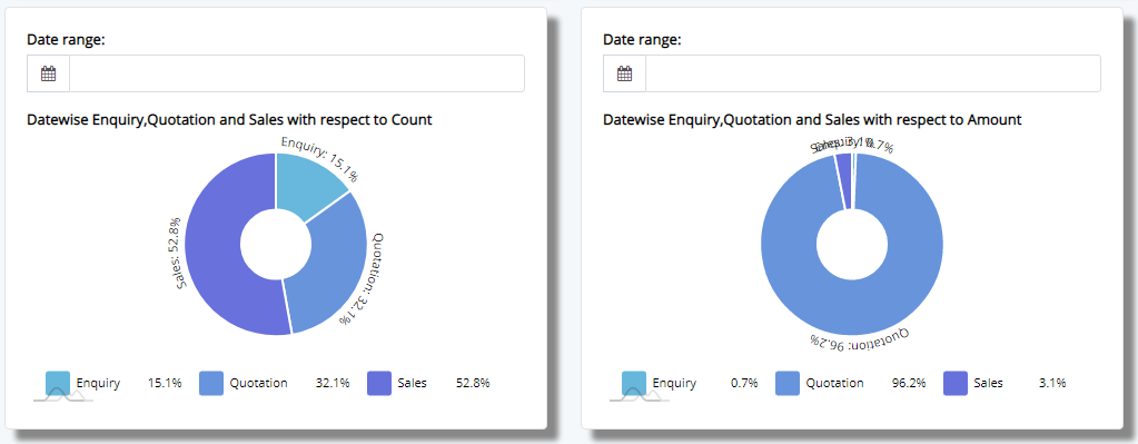
And then, we have a pie-chart section, where the the data is broken down wrt modules like the Enquiry, Sales and then Amount wise to display the data.
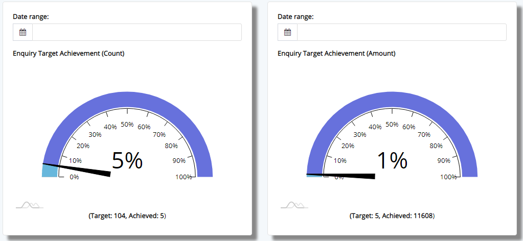
We have gauge which show the progress in Enquiry, Quotation and Sales made overall against the target set by the management for and individual employee.
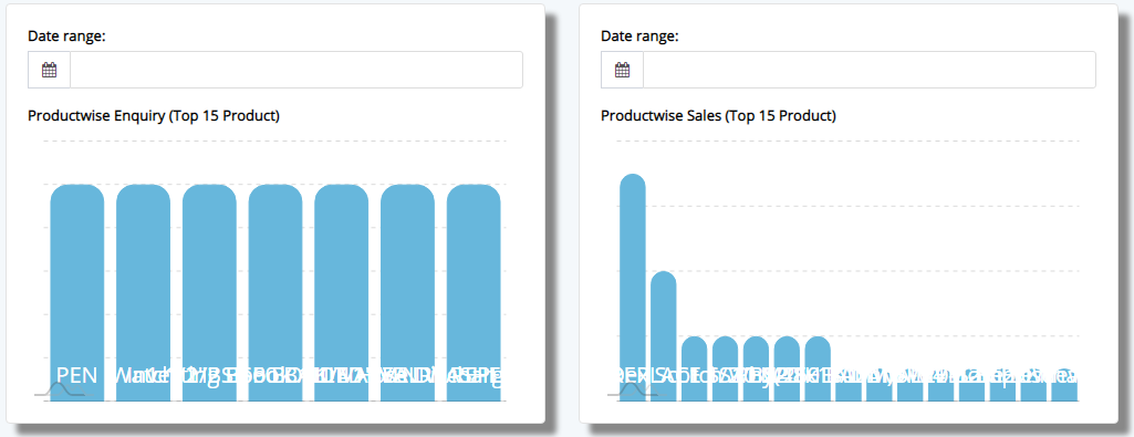
Then we have product wise bifurcation, which shows, the details for Top-15 products which are part of Enquiry, Sales and Quotation modules.
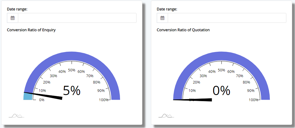
Then we have the Conversion Gauge which display conversion ratio against the number of incoming Enquiry, Quotation and Sales and to those which Won and Closed.
In the final section we have a range of pie-charts which bifurcates the date based on City, Category, etc for all the modules like Enquiry, Quotation and Sales.
This sums up the Representative Dashboard for CXO.