Enquiry CXO Dashboard if a vital view where, the CXO level employees will be able to view aggregated view of each modules.
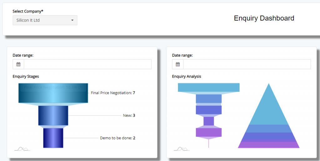
Here, the user will have to select the company for which the data is to aggregated to the view mode. Charts are automatically loaded with data but some need to additional date selection to view the data. In the above, the image you see, the data is aggregated in to Funnel and Pyramid charts.
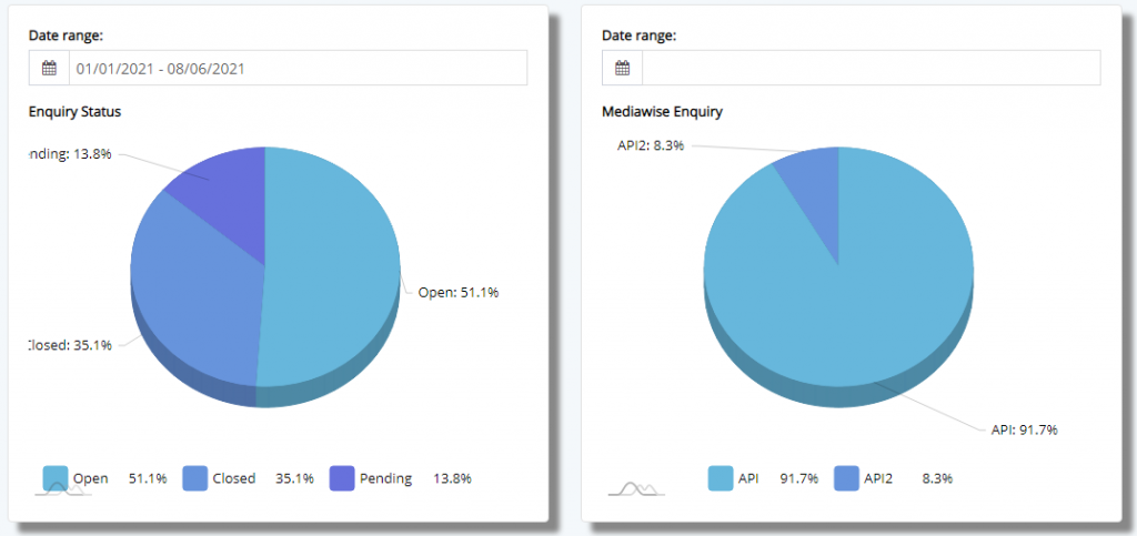
And then, we have a pie-chart section, where the the data is broken down wrt Status and Source wise to display the data.
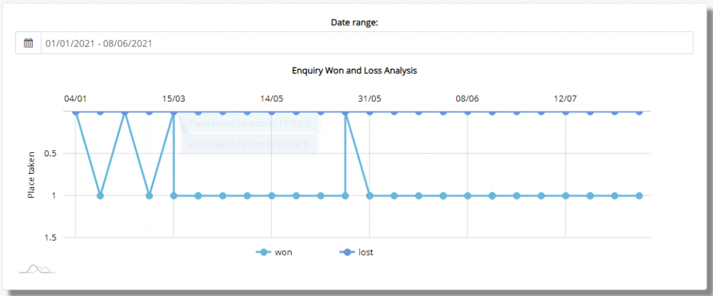
Furthermore, Enquiries are bifurcated based on Enquiries which are won or lost based on the closure conditions of the Enquiry.

The next section is solely related to Products that are enquired during the time span selected. This will help the CXO’s to chalk out the strategies which are favorable for organization to grow and focus on those products which performing very well the market and then later focus on those which are under-performing.
Then we have range of pie-charts, which bifurcates data based on City, State and Category.
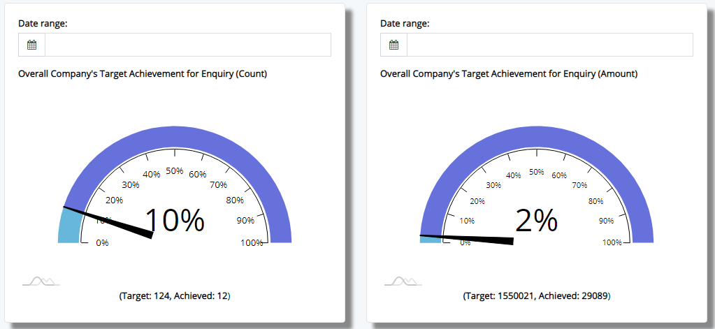
Finally, we have gauge which show the progress made overall against the target set by the management.
This sums up the Enquiry CXO Dashboard.